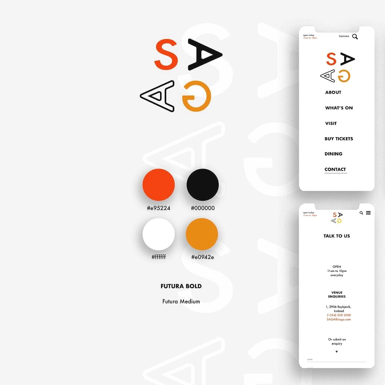
SAGA Exhibition Centre
Corporate Brand Identity + app for a new exhibition centre in Reykjavik, Iceland. The name was chosen based on Iceland’s \ progressive nature in embracing change and innovation.
(student concept work)
With considered communal spaces aplenty, a point of difference was created through the colour scheme chosen. In existing corporate identities, blue, green and white tones were predominant (drawing influence from the natural beauty of Iceland). The warm orange yellow colours were chosen as a symbol of warmth and gravitation.


